Specialized Bicycles
Specialized.com UI/UX
As the senior UX/UI designer at Specialized, I worked on implementing a higher design standard across the website, elevating the brand experience, and providing as much context as possible to aid in the purchasing process. My work ranged from cleanups to complete reimaginings and fresh ideation. I took a critical look at how riders are introduced to the brand, are guided through their journey, learn intuitively about Specialized products, and make informed, confident purchases. This work continues to empower riders to quickly get where they’re going or to dive into a wealth of informative storytelling, depending on their mindset.
How I contributed:
Combination of Psychological and Design Principles
Intersection of Digital and Physical Experiences
Iterative Design Approach
Low-Fidelity Wireframing and Journey Mapping
High-Fidelity Prototyping
Technical Design Documentation
A/B Testing
User Research Analysis
Animations and Interactions
Accessibility Consideration
Flexible Design Components
Holistic Experience Thinking

I designed a "Feature Highlight" Figma presentation tool used for stakeholder sell-in and general team awareness of new features being developed. For example, this feature was a redesign of the site's navigation that involved a horizontal drawer. This update allowed for a full design and hierarchy update, but more importantly aided in rider comprehension of the categories in the navigation.
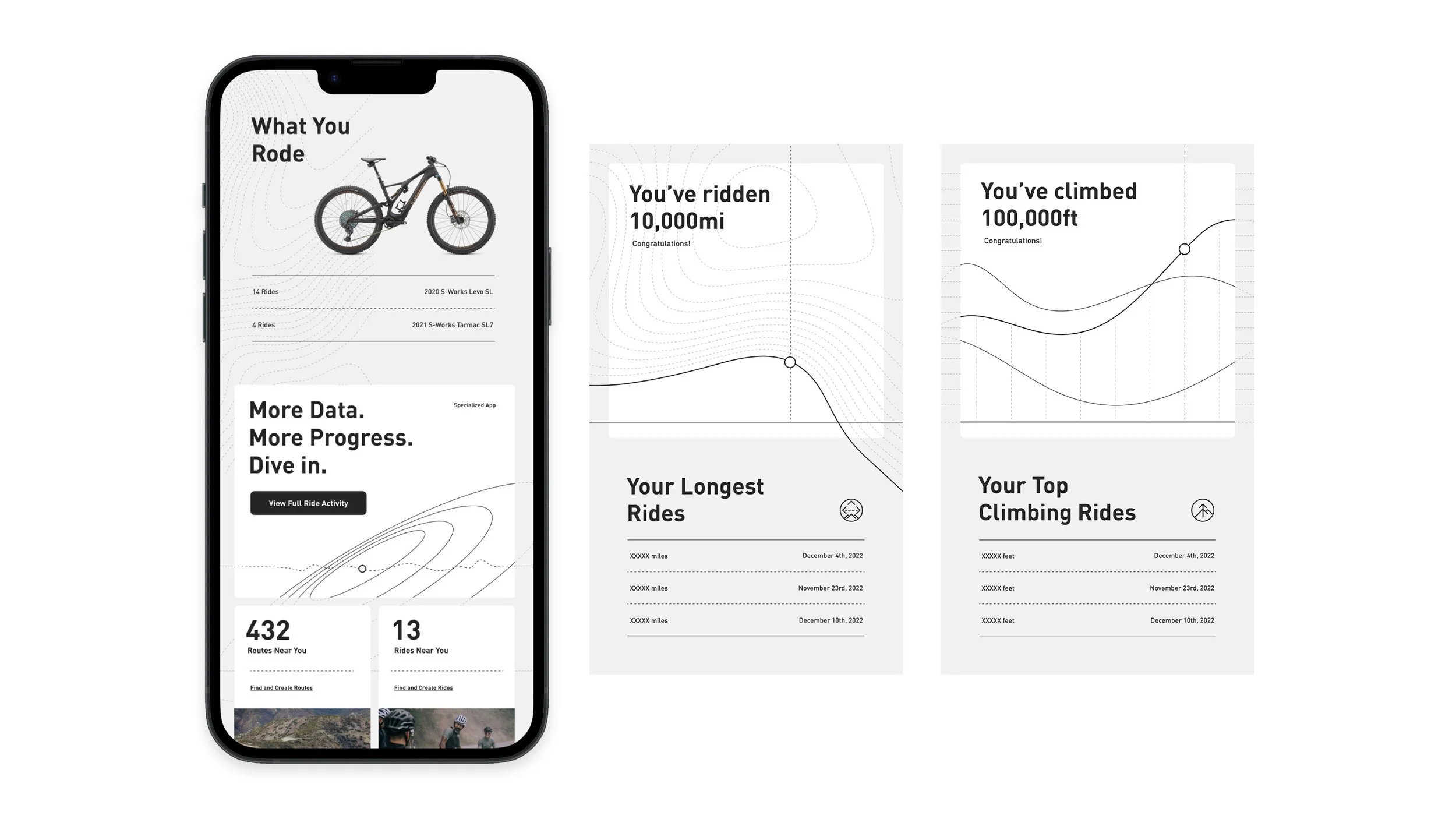
A fresh look and feel for ride metrics, showing visualizations of achievements and data for riders who track their rides on the Specialized app. The goal was to provide clarity to a rider's journey through relevant and empowering insights, and this visual look achieves that by bridging the gap between scientific analysis and personal evolution.
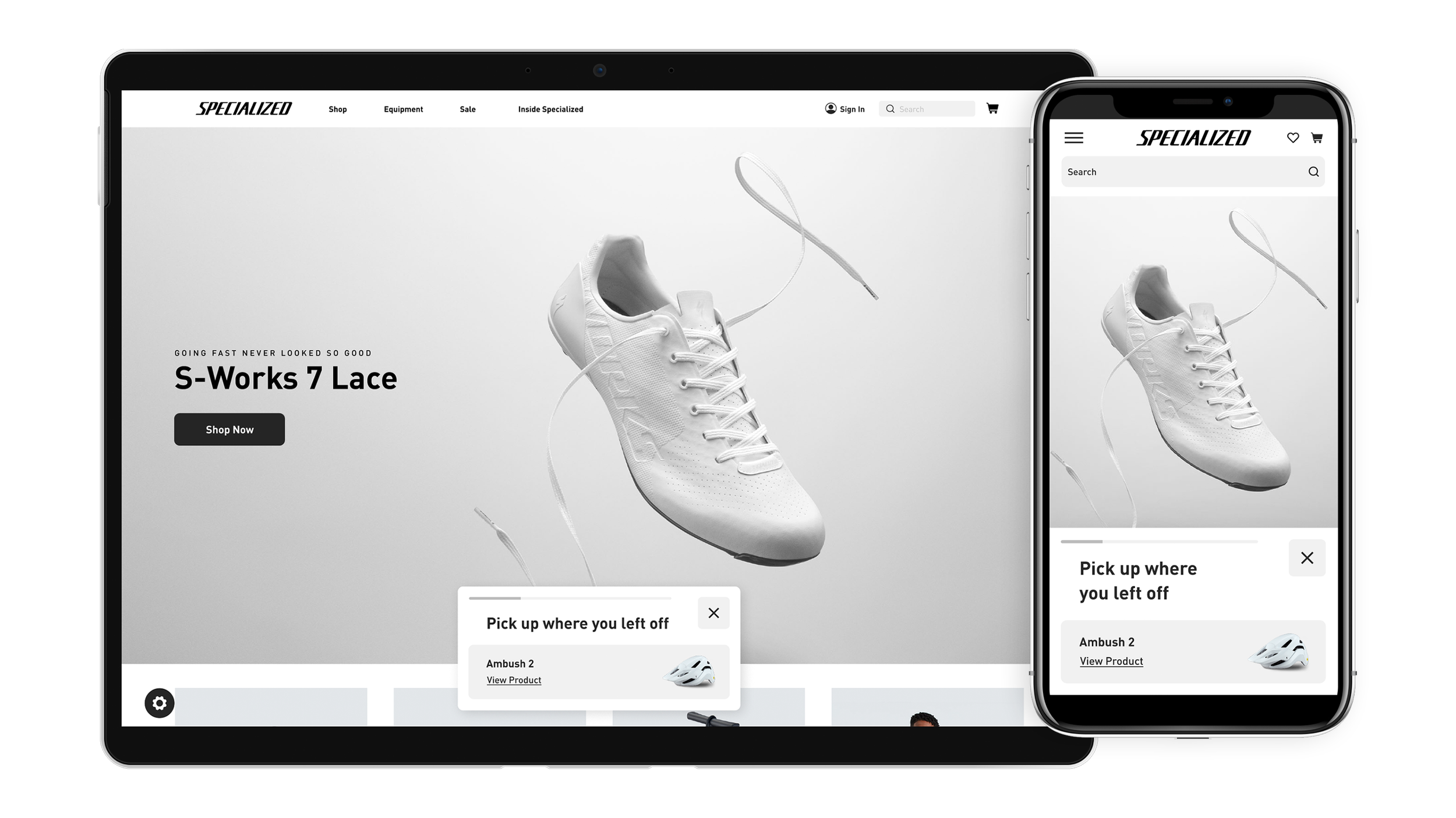
I collaborated with a UX researcher and a product manager to create a pop-up modal that allows the user to continue where they left off during their last active session on the site. This had a huge effect on conversions.

During the same collaboration as the above Continue Shopping modal, we also discovered that reviews could use a bit of help being discovered on product pages, as users weren't getting that far down on the page. I designed and developed a pop-up modal that is activated once per session that highlights the reviews section and contributes to the user's overall impression with the quality of Specialized products.
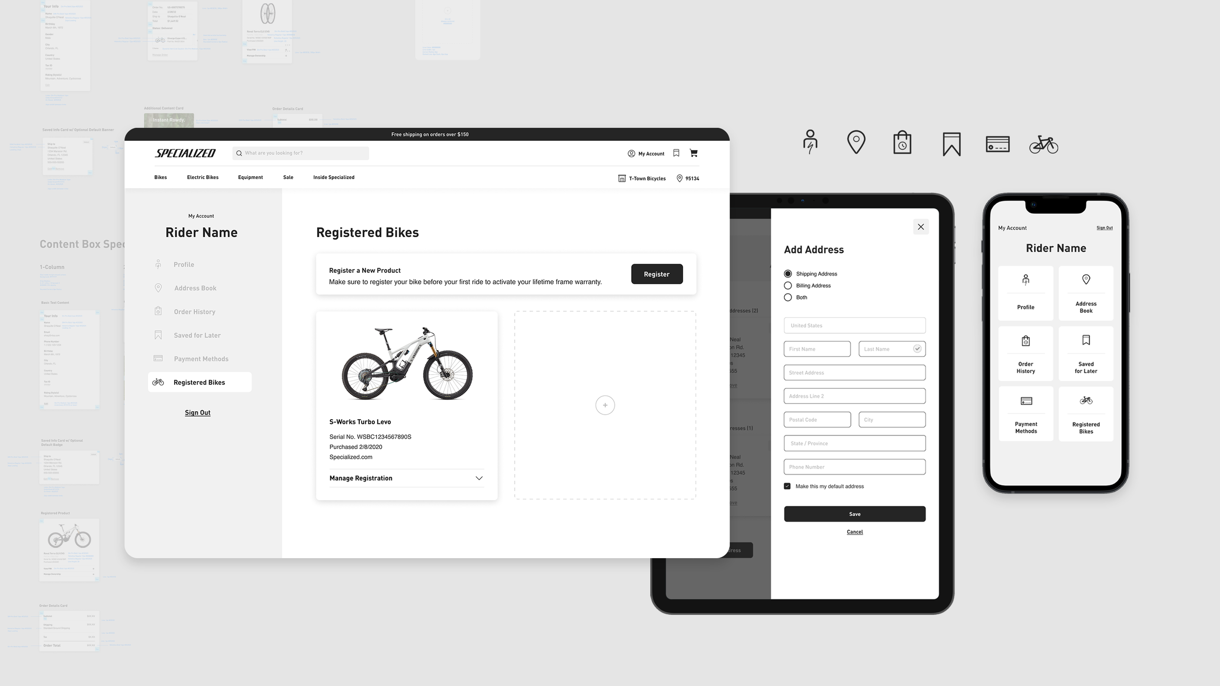
Redesign of Specialized's My Account section. The new layout is formed around rearrangeable and expandable content boxes, paving the way for future iterations.
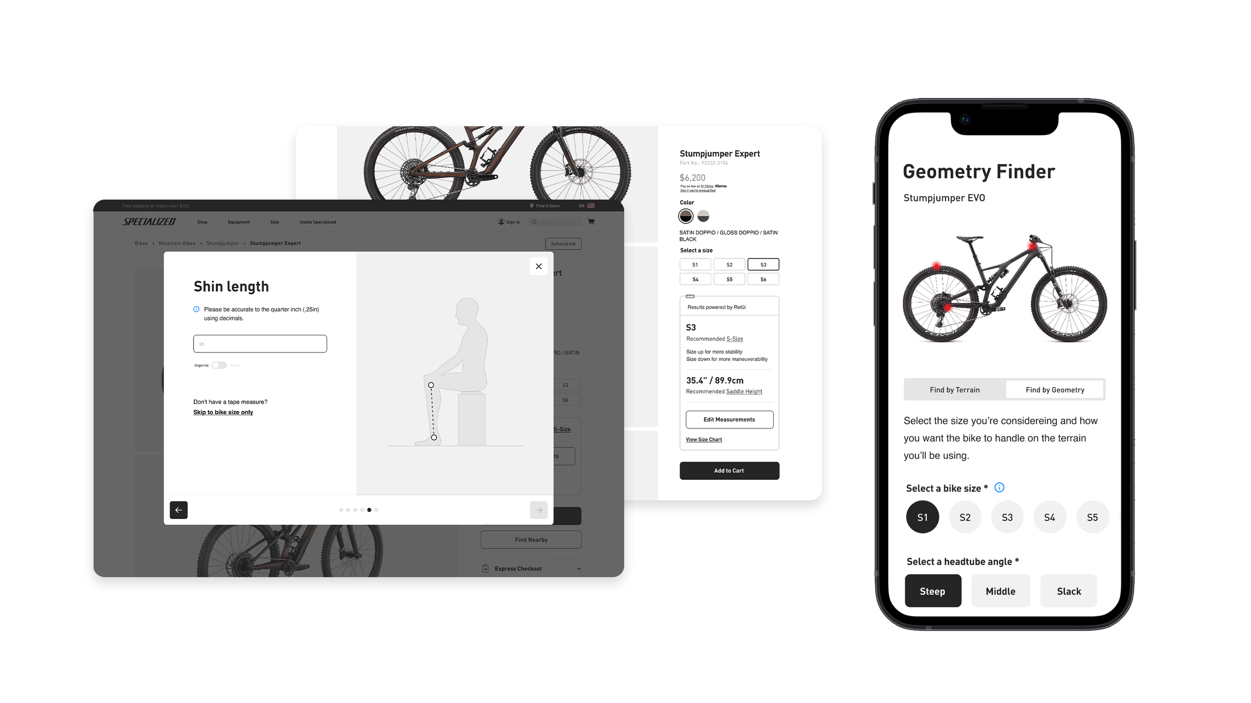
Complete restyling of all of the tools on the site, keeping the look and feel consistent and modern. These tools empower riders to feel confident about their purchase decisions, set up their bikes correctly, and be aware of the range of innovation that goes into Specialized products.

A new notification system that allows for multiple notifications at once, is quickly noticed, and easily dismissed.
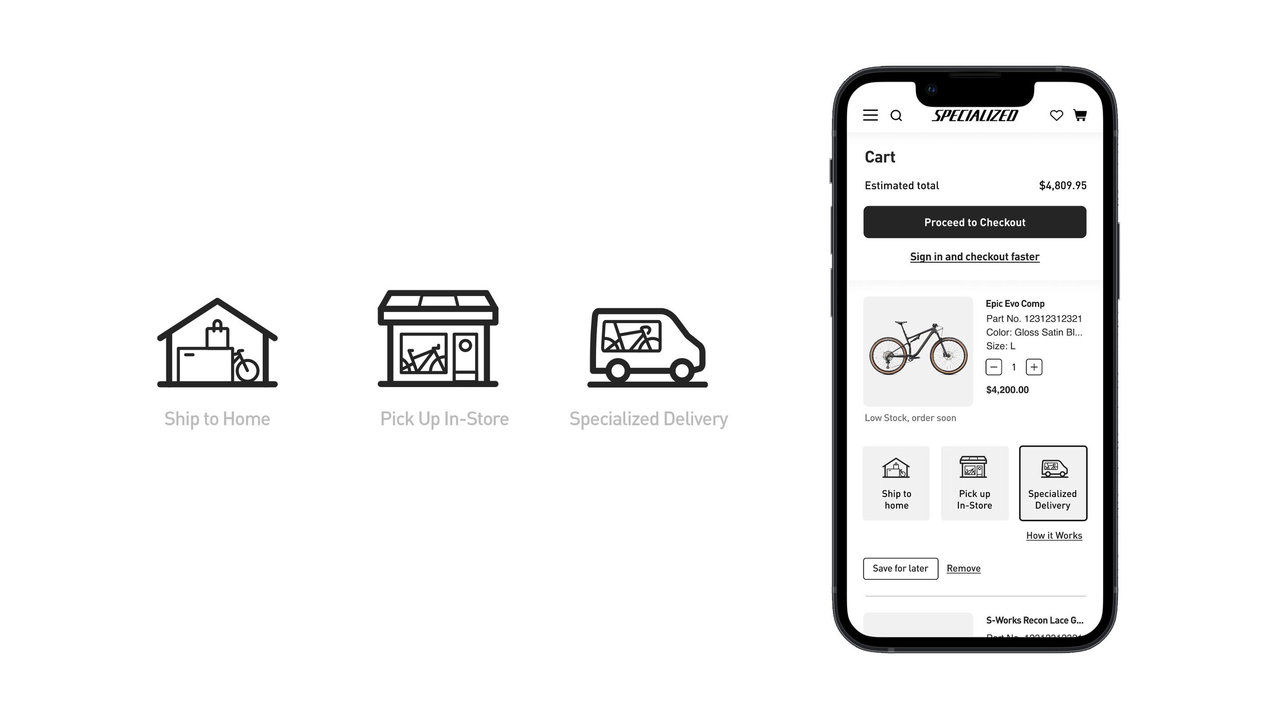
Delivery method icon development for our checkout flow. I also worked on the final stages of the checkout refactor project, helping ensure design accuracy and solving any user experience issues as they came up.
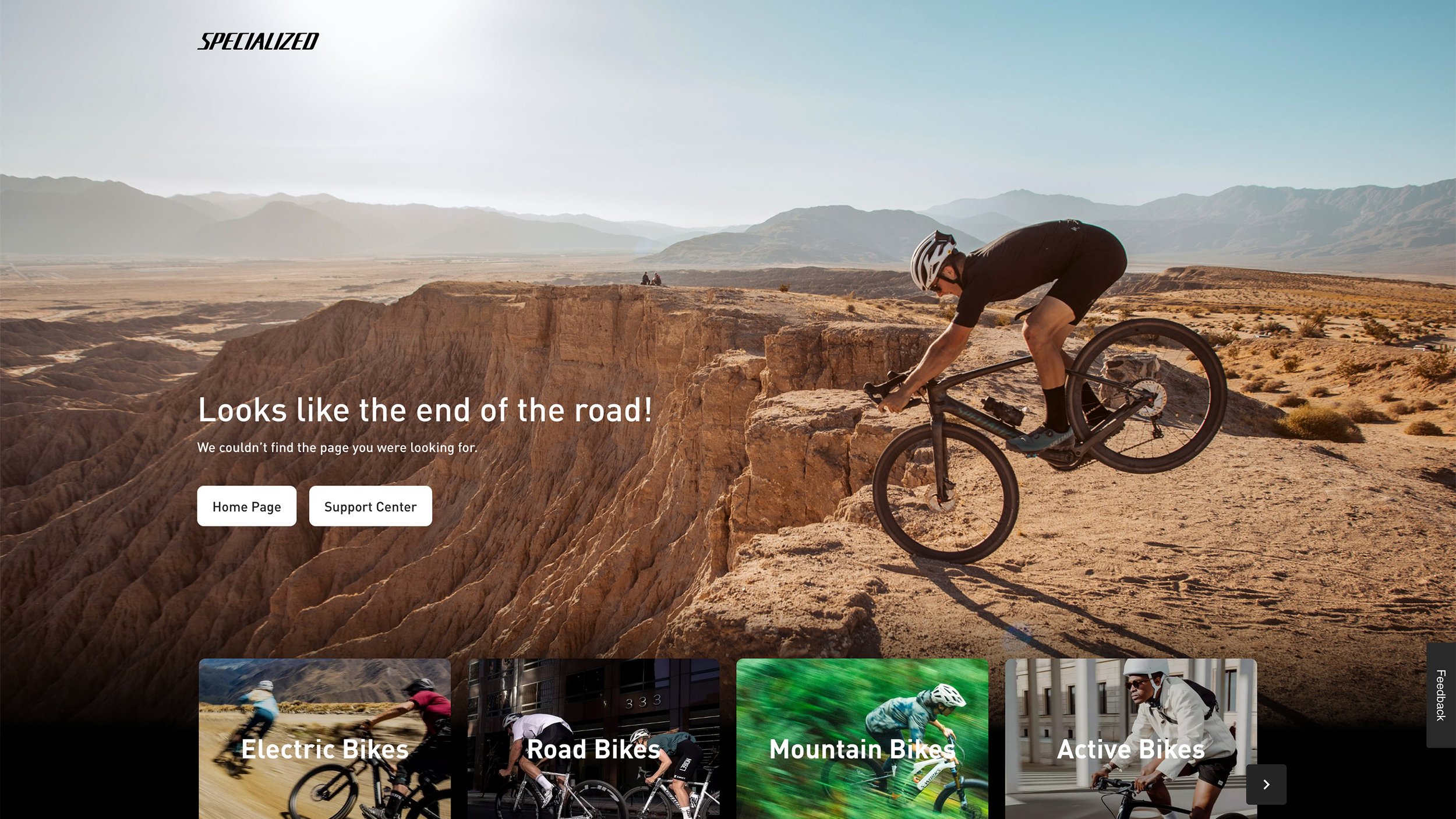
404 page with a culture-relevant headline and several options for next steps. More than a dead end!